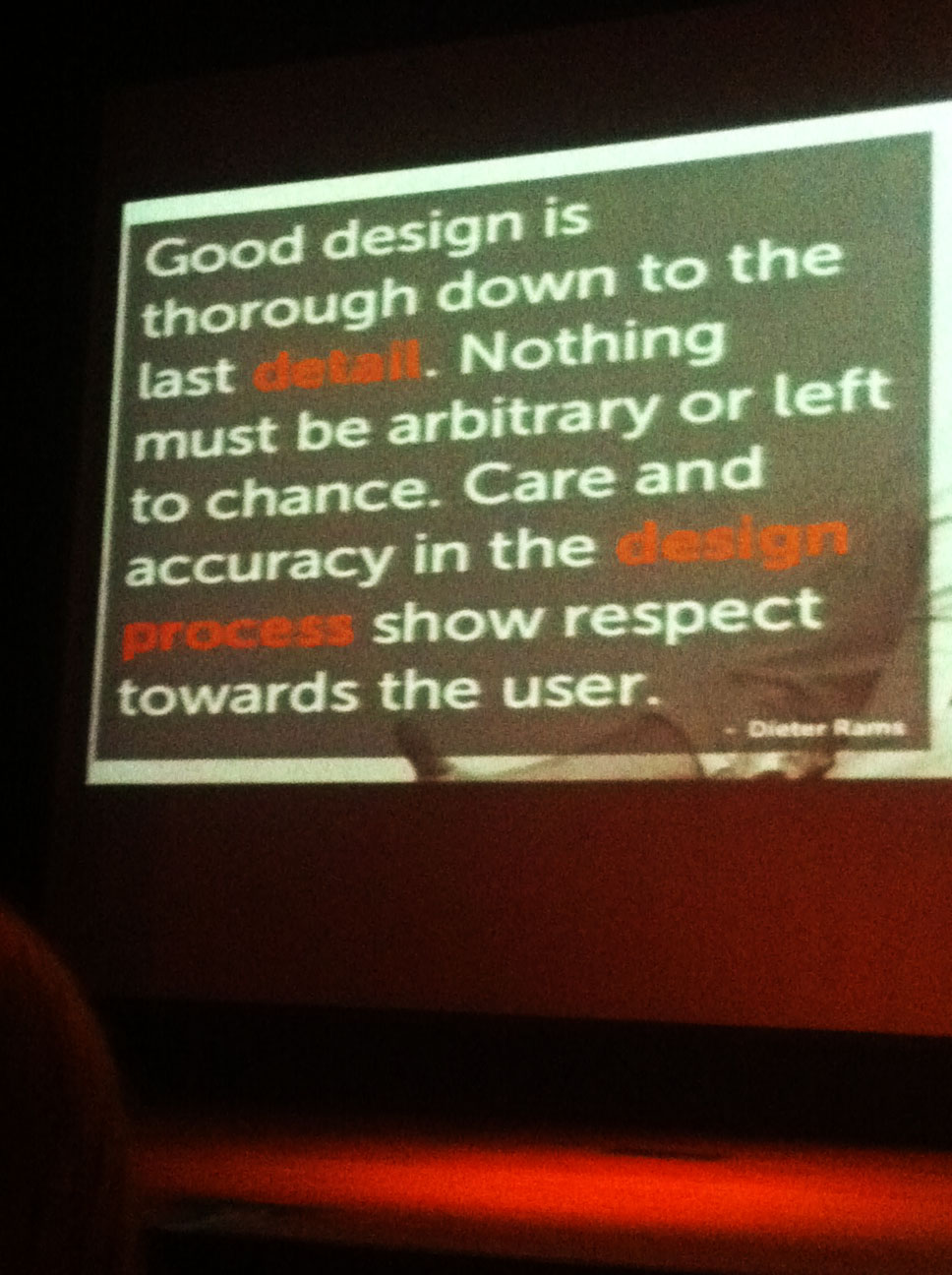
“What separates design from art is that design is meant to be… functional.”
―Cameron Moll
What site does use Single Web Page design effectively?
 The band Ousback’s website (http://www.iamousback.com/) combines some very appealing imagery and an enticing layout. The single page website opens with a huge hero image with a simple brushed name of the band. Which captures the lonely but also beautiful feeling very similar to the music of the band. The hero has visual dominance but doesn’t distract away from the navigation, it leads you to the two sections of the website: Listen & Connect.
  The two sections do not make you work to find the content you are looking for, the listen section displays four songs available for you to listen to, and link to purchase the CD. The connect section displays are short clear list of links to contact or follow the artist.
The website’s simple navigation and easily distinguishable content divisions, make this a successful single page website. The utilization of the single page works for this site because it does not try to convey to much information, and the transitions between the content is clear to a visitor to the site.
What sites does use Single Web Page design ineffectively?
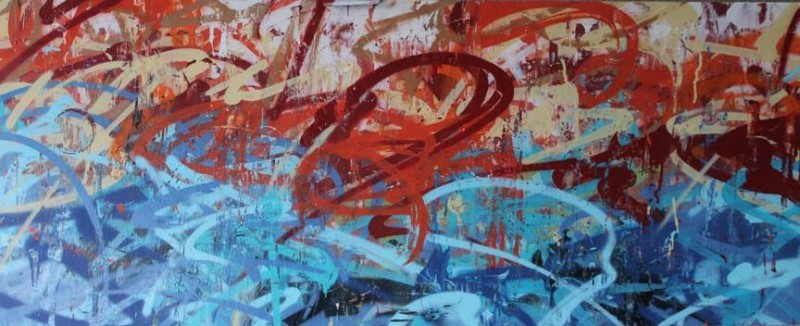
A site focusing on interactive design (http://www.reverenddanger.com/) has a beautifully designed website full of rich color and interesting graphics. But, I had one hell of a time navigating their site.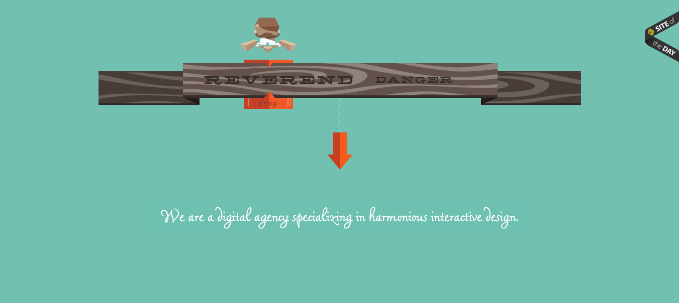 While the site’s beautiful flat design is very engaging each scroll down its page has something new pop out which identifies the section. Again not a bad thing, but you have to wait for that to load in order to have good context of where you are, or what you are reading in their website. Take the image to the right for example.
 While it is well designed if you had scrolled down and seen this image without the pop-up information coming up, what the hell would you think this was about?
I think this site is a great example of how something can be very tasteful and artistic, but it is limited because it is somewhat impractical. And after all that’s for the most part what website is for, it has to look good but it must be useable and practical.
Exercise #4 Spoiler Alert: Vitamin String Quartet
One of my favorites bands to listen to when I need some inspiration: The Vitamin String Quartet (http://www.vitaminstringquartet.com/). I feel they would benefit from a single page website because, they have a finite amount of information that needs to displayed, and it would also allow easy access to that information.![]() Their website as it is isn’t to bad a little dull, a red header with the greatest hierarchy grabs your attention first. That is a good thing though I think however, they could showcase their album art more to add contrast to their website. They has some very interesting covers that would make the site visually stimulating and encouraging more exploration of the site. As opposed to just searching a single section of the site and leaving.
Their website as it is isn’t to bad a little dull, a red header with the greatest hierarchy grabs your attention first. That is a good thing though I think however, they could showcase their album art more to add contrast to their website. They has some very interesting covers that would make the site visually stimulating and encouraging more exploration of the site. As opposed to just searching a single section of the site and leaving.